ART EVOLUTION DIARY
Art Evolution Notes
Ryder: The Deserter is the new project we are developing at Chimango Games. It is a fast-paced 2D platformer that tells the story of a secret agent who has the power to control objects, such as vehicles and rockets an even enemies! In this interview, Agustín Pérez Fernández, creative director, and Claudio Griglio, art director, explain how they carried out the process of aesthetic search, in collaboration with Adrián González, producer of the studio, until they found the artistic style that you now see in Ryder’s concepts pieces. The game’s art was not born alongside with gameplay mechanics in the process of creating Ryder, therefore, the challenge for the artist was to develop an art style that didn’t break the gameplay experience that worked so well from the beginning.
"The planning began at a game jam at home. The idea was to make a different platform game”, says Agustín. "I was bored of playing the same: platformers generally rely on jumping, so I wanted to see if I could achieve something different and that's when an idea came to mind, of a game based on riding things; To climb enemies, to ride rockets and different objects ".
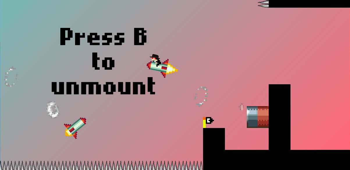
Every time we showcase the game at public events, people got a good impression, people got very involved while playing it; that’s when we thought that Ryder: The Deserter could be our first professional project, for PCs and consoles". Agustín also adds, laughing, that whenever they took the game to events, they showcase a prototype featuring "horrible graphics". Now is when Claudio comes into play:
"The prototype proved itself useful when we wanted to see the user's reaction to the gameplay," says Claudio, "the challenge was to create a new aesthetics to fit the gameplay correctly. We had a prototype that worked perfectly, we loved the gameplay from the beginning and the art shouldn’t have to break that. Gameplay mechanics didn’t stem from the art, but the other way around. "
Claudio mentions that the game was born with a comic book aesthetic, which is particularly evident in the main character, inspired by comic book characters such as The Spirit. "For backgrounds, we work with more creative freedom, formulating aesthetics more typical of cartoons and not so much of comic books," adds Claudio.
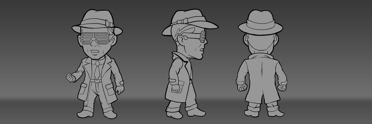
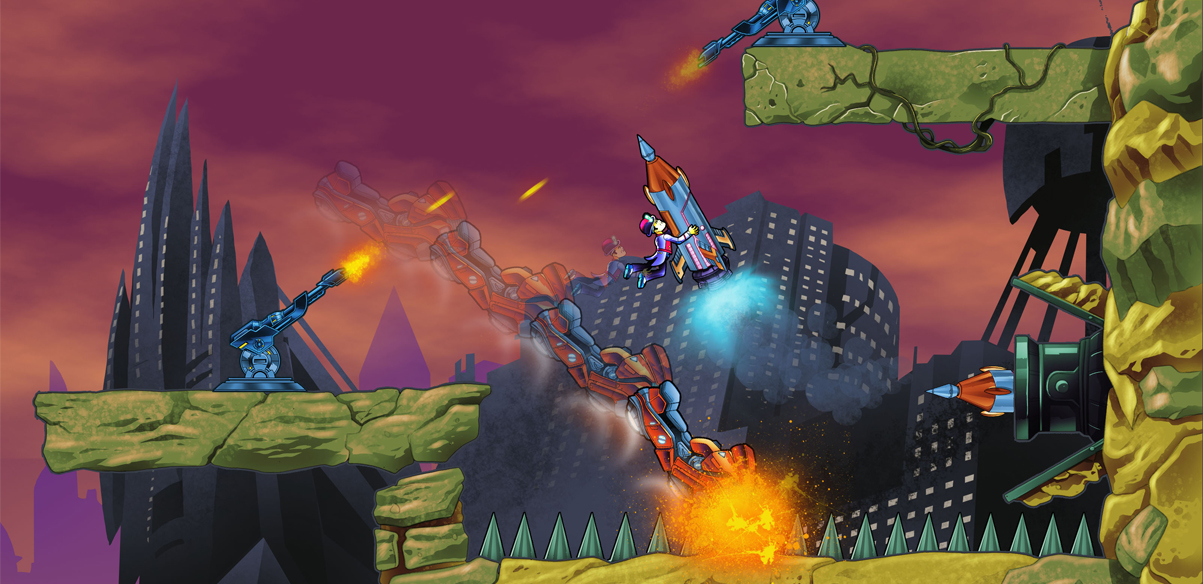
Claudio explains that Ryder went through four stages of aesthetic transformation. In the first conceptualizations, details were excessive, spoiling the gameplay experience which was so functional in prototypical builds. We started to refined everything, it’s was quite a long process. The first concept art didn’t much the game at all. The first conceptual stages correspond to the exhibition of Ryder in the context of two expos: MICA 2015 (Market of Cultural Industries) and Espacio Santafesino 2016, points of contact between creative industries of our country, Argentina.
(Very first concept art of Ryder)
(Second stage of conceptual design)
Agustín traveled to San Francisco in late February to showcase Ryder at Game Developers Conference and Game Connection America. The third aesthetic stage of development corresponds to the builds we took to those expos. "It was the first time we took the game to an event featuring the new graphics", says Agustín. The graphic style was very different form the minimalistic pixel art of the initial prototype. Unfortunately, it wasn’t as impressive as we wanted. "The backgrounds didn’t show an appropriate level of contrast; we complicated everything regarding perspective and we overlook other issues in the rush to wrap up a playable build for the events."
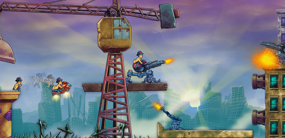
We gathered a lot of useful feedback at GDC and GCA, resulting in a new major aesthetic change, the so-called stage four, as seen in most recent concept art, especially in character and background visual synthesis. "My approach to aesthetic research was always to look for contrast of colors, palettes and shapes, to achieve a gameplay experience that felt the same as in the prototype," says Claudio.
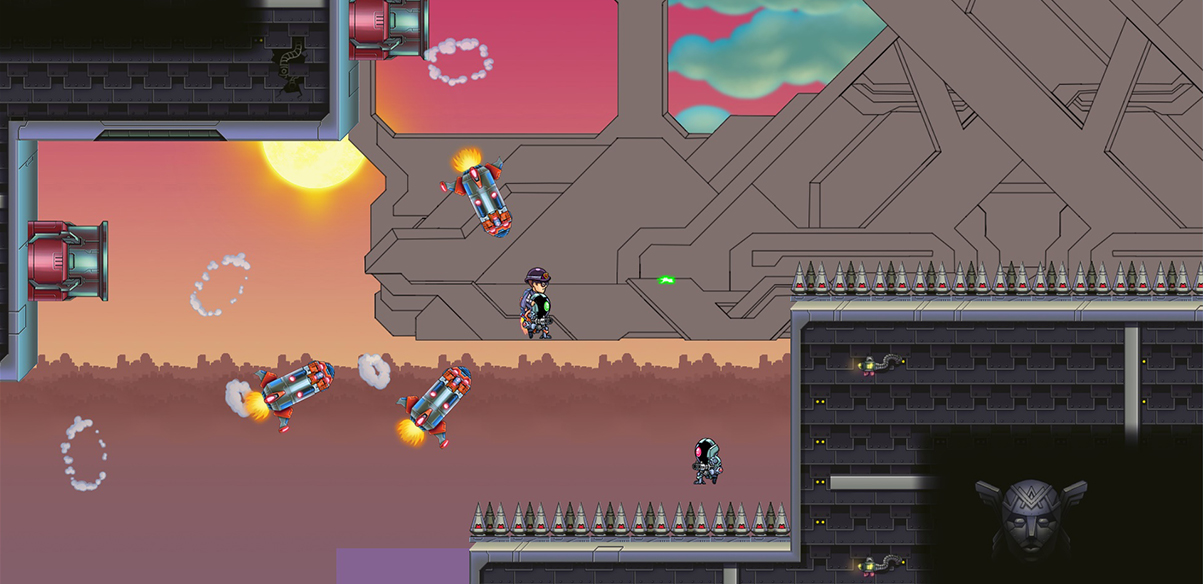
For GDC and GCA, we had much more detailed concepts (image above), and platforms and backgrounds were in the spotlight, which took attention away from the most important elements of the gameplay. In the words of Claudio, "We had added depth and perspective in a way it was aesthetically beautiful, but when we applied it to gameplay, we realized that to respect that perspective, we should have a lot more tiles."
Current concept art, there’s a separation between characters (and other important elements) and platforms and backgrounds. This separation is achieved by color palettes, that is, everything got simplify and, applied to gameplay, it means less production of assets and tiles.
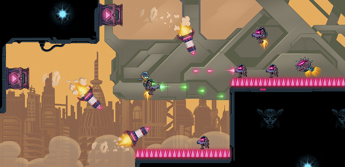
(One can easily identify characters - both the playable character and enemies -, danger zones and platforms.)
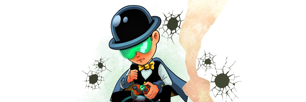
We also minimize details for the characters, we made them a little more iconic. For the protagonist final concept, we returned to the initial prototype: we made him elegant, wearing a small top hat. "I simply love the way he was at the beginning," Claudio confesses. But there were some changes, anyway: "The red eyes from the prototype are gone, now the red color is identified with dangerous elements, so the character is green – he wears that color in his glasses." One of the important features of the gameplay is that the character can get on vehicles and enemies. Visual aesthetics indicates when he takes control of them using colors: they go from red, which indicates danger, to green.
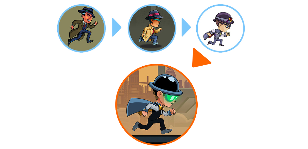
(Main character’s design evolution)
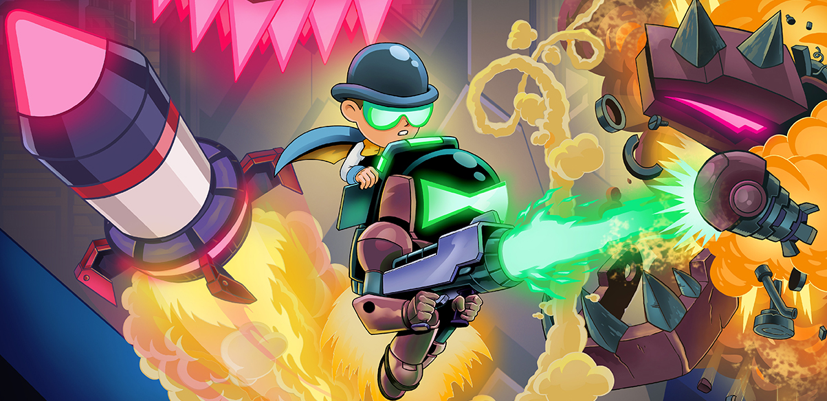
(Now you can see the result of the aesthetic research, applied in detail. This is the previous step to applied the art style to the assets of the game.)
Character simplification also implied a shape research as well. "In early concepts, the face can’t be properly understood due to the high levels of detail fitted neatly together in such small space. Now, character silhouettes are easily identify and you can differentiate them from each other", explains Claudio.
You can know that a character's shape is correct, if you can understand it by looking at it as a silhouette. This search for a suitable shape was one of the concerns we brought from GDC. Claudio explains the process: "We got rid of unnecessary details, which were mostly cosmetic, and then delineate every shape to make it clear if a character is handling with a weapon, for example, or to show what their most vulnerable point is. We reinforce shapes with the uses of colors. "
Ryder's new graphic style will allow us to deliver some gameplay mechanics more clearly, as Agustín explains: "Some mechanics are just sketched, we haven’t added them to any playable prototype yet, and although those mechanics weren’t inspired by the new game art style, we believe that the art will now help to integrate them into the game.”
Right now, as we have reached a compelling conceptual stage, we are working on the graphic assets to be used in the game: tiles, level entities and animations, among others. The game has already undergone the biggest aesthetic transformation, but that doesn’t mean that we have stopped there. Ryder is going to undergo minor changes, anyway, since concept art never truly reflects what ends up applied to the game. The technical process of adding the graph to a game involves changes per se.
It remains to be seen how this aesthetic style is applied to other settings, as we are currently working with technological and retro-futuristic scenarios of the secret base from which the character escapes. Later in the game come more rural environments, of more precarious buildings, that is to say, another type of very different scenarios.
It remains to be seen, however, if this aesthetic style will fit well in new. We’re currently working on technological and retro-futuristic levels of the secret base from which the character escapes. There’s still many more to come, including rural environments featuring scrappy buildings, that is to say, settings of quite another kind.
The artistic work has not ended yet. Once the graphics are implemented into the game, the next phase involves art-polishing. As Claudio says, "much remains to be done and we are always in continuous evolution."
Interview and Text Coordination: Florencia Orsetti
Get Ryder: The Deserter
Ryder: The Deserter
Action platformer with exciting features. Ride and combine different vehicles to complete the levels
| Status | In development |
| Author | Chimango Games |
| Genre | Platformer, Action, Adventure |
| Tags | deserter, hard, hardcore, retry, timetravel |
Leave a comment
Log in with itch.io to leave a comment.